(2018-May-20) A childhood dream to travel around the world fueled by reading Gulliver's Travels stories and Robinson Crusoe attempts to survive on a deserted island. Those books were filled with geographical description and map locations. I think I always loved working with maps and I still do! There is something that could captivate your mind and propel your imagination for traveling when you immerse yourself in maps.
Power BI itself a great tool that could feed your appetite for an adventure using built-in and custom map visualizations.
The built-in (or native) map visualizations are available right away when you install the Power BI desktop for the first time and Microsoft has provided sufficient information for you to get started working with them:
- Map
- Filled Map
- ArgGIS Map
- Shape Map
And there is another set of custom map visualization that we can use in building data analytics in Power BI (not a complete list):
- Flow map by Weiwei Cui
- Heatmap by Weiwei Cui
- Globe Map by Microsoft
- Icon Map by Altius
- Mapbox Visual by Mapbox
Since there is more information about the built-in map visualizations then I'd like to share my experience working with the custom ones.

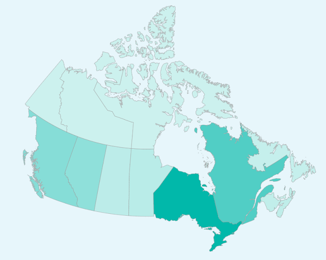
But before I do this, let me spend a few minutes describing how the Shape Map (still in Preview at the moment) works.
Shape Map
https://docs.microsoft.com/en-us/power-bi/desktop-shape-map
Once you enable this Preview feature in your desktop version of the Power BI then can you use a predefined set of Shapes:

or you can free your mind and upload a custom shapefile with Canadian provinces and Northen Territories, which I did from this site http://mapstarter.com/.
Flow map by Weiwei Cui
https://appsource.microsoft.com/en-us/product/power-bi-visuals/WA104380901
https://weiweicui.github.io/PowerBI-Flowmap/
Flow map is a special type of network visualization that portrays movements of objects among geo-locations.
I built a simple dataset with the list of Provinces and Territories capitals and linked them all to Ottawa (Canadian capital). The component itself has a very rich set of formatting settings which I liked the most; so the final visualization could look totally different by changing one of them.

Heatmap by Weiwei Cui
https://appsource.microsoft.com/en-us/product/power-bi-visuals/WA104381072
https://weiweicui.github.io/PowerBI-Heatmap
Heat maps are a type of visualization to show data density on a map. They are particularly helpful when you have a lot of (e.g., tens of thousands of) data points on the map and are mainly interested in their overall distribution. Technically, in a heatmap, data points are aggregated locally and mapped to colors (either gradient or quantile), so that we can make better sense of the density of the data from the colors while still being able to see and use the map.
I already blogged about the use of the heatmaps in Power BI - http://datanrg.blogspot.com/2018/01/when-its-cold-outside-perhaps-power-bi.html and we can always use the built-in ArgGIS heat maps option as well to see alternative ways for your dataset density.

Globe Map by Microsoft
https://appsource.microsoft.com/en-us/product/power-bi-visuals/WA104380799
One the best features of the GlobeMap is that it allows you to rotate the Globe and see it from different angles, and this is right within your Power BI report.
Globe Map is a 3D Map that makes the map exploration experience more immersive and magical. It provides the sense of connection to the data with the physical world. This, combined with our spatial ability, brings a new perspective to the data when presented as 3D objects. Globe Map also supports heat map on the spatial map. You can use a second measure for heat intensity and draw immediate attention to the right areas.
I used the Berkley Earth datasets - http://berkeleyearth.org/data/ for this 3D reporting which was already featured in my previous blog post - http://datanrg.blogspot.com/2016/02/excel-power-map-vs-power-bi-globe-map.html

Icon Map by Altius
https://appsource.microsoft.com/en-us/product/power-bi-visuals/WA104381497
The Icon Map visual shows data-bound images & lines or circles on a map and allows you to render images and lines or circles on the map.

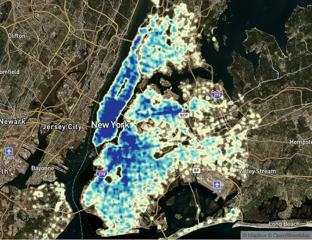
Mapbox Visual by Mapbox
https://appsource.microsoft.com/en-us/product/power-bi-visuals/WA104381472
https://github.com/mapbox/mapboxgl-powerbi
https://www.mapbox.com/help/power-bi/
The Mapbox makes heatmaps, circles, and clusters using big location data.
Your location data is more than just points on a map. With the Mapbox Visual for Power BI, quickly create beautiful custom map visuals that answer your business question with fast performance.
And here is the actual Power BI report with some of the custom map visualizations:
Happy data adventures!
Power BI itself a great tool that could feed your appetite for an adventure using built-in and custom map visualizations.
The built-in (or native) map visualizations are available right away when you install the Power BI desktop for the first time and Microsoft has provided sufficient information for you to get started working with them:
- Map
- Filled Map
- ArgGIS Map
- Shape Map
And there is another set of custom map visualization that we can use in building data analytics in Power BI (not a complete list):
- Flow map by Weiwei Cui
- Heatmap by Weiwei Cui
- Globe Map by Microsoft
- Icon Map by Altius
- Mapbox Visual by Mapbox
Since there is more information about the built-in map visualizations then I'd like to share my experience working with the custom ones.

But before I do this, let me spend a few minutes describing how the Shape Map (still in Preview at the moment) works.
Shape Map
https://docs.microsoft.com/en-us/power-bi/desktop-shape-map
Once you enable this Preview feature in your desktop version of the Power BI then can you use a predefined set of Shapes:

or you can free your mind and upload a custom shapefile with Canadian provinces and Northen Territories, which I did from this site http://mapstarter.com/.

Flow map by Weiwei Cui
https://appsource.microsoft.com/en-us/product/power-bi-visuals/WA104380901
https://weiweicui.github.io/PowerBI-Flowmap/
Flow map is a special type of network visualization that portrays movements of objects among geo-locations.
I built a simple dataset with the list of Provinces and Territories capitals and linked them all to Ottawa (Canadian capital). The component itself has a very rich set of formatting settings which I liked the most; so the final visualization could look totally different by changing one of them.

Heatmap by Weiwei Cui
https://appsource.microsoft.com/en-us/product/power-bi-visuals/WA104381072
https://weiweicui.github.io/PowerBI-Heatmap
Heat maps are a type of visualization to show data density on a map. They are particularly helpful when you have a lot of (e.g., tens of thousands of) data points on the map and are mainly interested in their overall distribution. Technically, in a heatmap, data points are aggregated locally and mapped to colors (either gradient or quantile), so that we can make better sense of the density of the data from the colors while still being able to see and use the map.
I already blogged about the use of the heatmaps in Power BI - http://datanrg.blogspot.com/2018/01/when-its-cold-outside-perhaps-power-bi.html and we can always use the built-in ArgGIS heat maps option as well to see alternative ways for your dataset density.

Globe Map by Microsoft
https://appsource.microsoft.com/en-us/product/power-bi-visuals/WA104380799
One the best features of the GlobeMap is that it allows you to rotate the Globe and see it from different angles, and this is right within your Power BI report.
Globe Map is a 3D Map that makes the map exploration experience more immersive and magical. It provides the sense of connection to the data with the physical world. This, combined with our spatial ability, brings a new perspective to the data when presented as 3D objects. Globe Map also supports heat map on the spatial map. You can use a second measure for heat intensity and draw immediate attention to the right areas.
I used the Berkley Earth datasets - http://berkeleyearth.org/data/ for this 3D reporting which was already featured in my previous blog post - http://datanrg.blogspot.com/2016/02/excel-power-map-vs-power-bi-globe-map.html

Icon Map by Altius
https://appsource.microsoft.com/en-us/product/power-bi-visuals/WA104381497
The Icon Map visual shows data-bound images & lines or circles on a map and allows you to render images and lines or circles on the map.

Mapbox Visual by Mapbox
https://appsource.microsoft.com/en-us/product/power-bi-visuals/WA104381472
https://github.com/mapbox/mapboxgl-powerbi
https://www.mapbox.com/help/power-bi/
The Mapbox makes heatmaps, circles, and clusters using big location data.
Your location data is more than just points on a map. With the Mapbox Visual for Power BI, quickly create beautiful custom map visuals that answer your business question with fast performance.

And here is the actual Power BI report with some of the custom map visualizations:
Nice
ReplyDeleteThanks for details explanation.
ReplyDeleteMicrosoft Power BI Online Training
In each organization the time is an essential factor for their venture, so you need to help the entire information of the organization for making the task for the organization in a brief span which isn't simple for you. You can make it simple by picking the administrations see this https://activewizards.com/ , which gives you the information researcher who encourages you to comprehend the enormous information of the organization in a brief span.
ReplyDelete