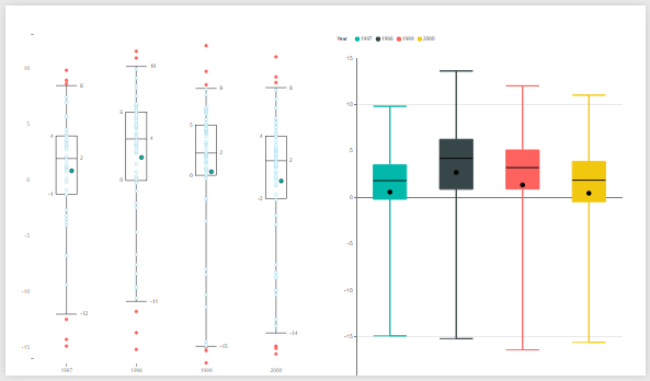
[2016-Apr-30] I don't work with box plot charts very often, however when I do then it becomes a very interesting experience. First, it starts from data extraction and then playing around with various visual settings to make those boxes and whiskers to look good.
I assume that sometimes we tend to work with more familiar chart types to analyze our data, like lines and vertical or horizontal charts; however box plot charts could be very well used to review how your data is distributed within your set of metric values; and besides, it looks different as well :-)
About 3 months ago Microsoft made this type of visualization available in Power BI (Visual Awesomeness Unlocked – Box-and-Whisker Plots), so I decided to compare it with the same box plot chart that I can create using SQL Reporting Services.
My data comes from Berkely Earth (http://berkeleyearth.org/data/) that I had already used for one of my previous PowerMap visualization (Earth Surface Temperature on YouTube). And I took 4 years data of May monthly average temperature from all Canadian Geo stations (1997 - 2000) and showed them both in Power BI and SSRS.
Power BI:
Currently there are two version of the Box & Whisker charts: (1) created by Brad Sarsfield and (2) another created by Jan Pieter Posthuma.
(1) Brad Sarsfield box and whisker chart
Pros:
- Customization for chart quantile value is available
- Outliers visualization
- Simple data set required Values/Group (values and groups those values are divided to)
Cons:
- Margins for quantiles are rounded to zero decimal places
(2) Jan Pieter Posthuma box and whisker chart
Pros:
- Boxes are colored
- Margins for quantiles are not rounded to zero decimal places
Cons:
- No customization for quantile value (it's preset to Min, 0.25, Mean, Median, 0.75, Max)
- Along with Values/Group settings for dataset, Samples has to be specified (which is basically an attribute for lowest granularity you want to analyze your data)
SSRS:
Pros:
- The only SSRS chart for box plot visualization
- More settings can be adjusted compared with similar Power BI visualization
Cons:
- Chart dataset has to be prepared in advance for all 6 data elements (Min, Low, Mean, Median, High, Max)
- The only SSRS chart for box plot visualization.
Conclusion:
I personally like Power BI Brad Sarsfield box & whiskers visualization with the way it looks and its customization level, however I also like that margin values for quantiles are not rounded to zero decimal places at Jan Pieter Posthuma visualization.
Thanks for reading this blog post, and happy data adventures!


Your Information was very good and its very clear Power BI Online Training
ReplyDeletethank you for sharingPower BI Online course.
ReplyDeleteI read your blog nice explanation, Thank you for share this valuable information with us. Keep share more content MSBI Online Training
ReplyDeleteThis is an excellent news go get it who are looking for the chance and check at MSBI Online Training Hyderabad
ReplyDeleteNice blog thank you for sharing
ReplyDeletePower BI Online Training
I feel satisfied to read your blog, you have been delivering a useful & unique information to our vision even you have explained the concept as deep clean without having any uncertainty, keep blogging. Power BI Online Course
ReplyDelete