I was listening for Phil Collins' "True Colors" song in my car audio this morning and it reminded me about the very issue that PowerView currently has: that it doesn't allow to set specific colors to different elements of its own visuals. There are more and more announcements made about coming changes and improvements in this area for Power BI, however if you're still using SharePoint or Excel based PowerView charts, this might be a challenge for you.

There is a way to change colors in PowerView with the help of setting different themes though (Format Power View reports); however I don't really like this approach when one theme change affects all of your PowerView slides and there is not much control left on how to set different colors for different sections of your report.
So I have come with a quick workaround on how certain colors are still can be chosen for my PowerView visuals.
For this demo test I have pulled 2 data sets from Wikipedia using PowerQuery and pushed them further into a PowerPivot model.
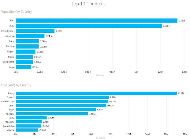
1) Top 10 Countries by Population (https://simple.wikipedia.org/wiki/List_of_countries_by_population)
2) Top 10 Countries by Territory (https://simple.wikipedia.org/wiki/List_of_countries_by_area)


There is a way to change colors in PowerView with the help of setting different themes though (Format Power View reports); however I don't really like this approach when one theme change affects all of your PowerView slides and there is not much control left on how to set different colors for different sections of your report.
So I have come with a quick workaround on how certain colors are still can be chosen for my PowerView visuals.
For this demo test I have pulled 2 data sets from Wikipedia using PowerQuery and pushed them further into a PowerPivot model.
1) Top 10 Countries by Population (https://simple.wikipedia.org/wiki/List_of_countries_by_population)
2) Top 10 Countries by Territory (https://simple.wikipedia.org/wiki/List_of_countries_by_area)
Then I created simple PowerView charts to show this data:

And here is a big question: what if I want to color top chart with Color A and second one with Color B; still not much options left with the existent PowerView interface. But I've noticed that with each color theme there is an order of particular colors, so even if I'm not allowed to set a specific color, I still have a control to choose colors from the existent theme and set them based of my customers' needs.
Default color theme starts with Blue, then goes Red, Yellow and other colors. So I added blank columns to the PowerPivot model's tables (Color 1 & Color 2):
And then I could place empty columns to the set of Values of my PowerView chart this way:

so that by default [Color 1] column would be Blue colored, [Color 2] column will be Red and real Value will become Yellow. Here is a trick: since both [Color 1] & [Color 2] are empty columns, no colors will be shown for them and only one Yellow color will prevail in the chart :-)

You can play a little bit more with this example; I've saved all PowerQueries, PowerPivot model and PowerView charts in this Excel file (Top10Countries.xlsx).
Eventually your PowerView charts can get close to your "true colors" and that's why I like it :-)
Comments
Post a Comment