(2018-Jan-13) You never know how the weather will behave itself, especially when the temperature gets dramatically changed from +10 to -10 within a day. During this Christmass and New Year holidays, it was very cold here in Canada. So I thought to explore some open data set that may contain historical temperature records and if possible geo-coordinates to locate those thermal data points to.
About two years ago I already had created a blog post “Excel Power Map vs. Power BI Globe Map visualization” based on the Berkley Earth datasets - http://berkeleyearth.org/data/. At that time I was probing the 3D Globe Power BI visualization, the one that you can use and rotate it right within your report.
This time I thought to check and compare heat map visualizations in Power BI. Currently, there are two ways to see variously heated or cooled geo areas in Power BI, either using a standard ArcGIS Map visualization or a custom Power BI Heatmap visualization from the Office store - https://appsource.microsoft.com/en-us/product/power-bi-visuals/WA104381072?src=office&tab=Overview
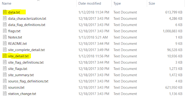
The Berkley Earth dataset for this data case exercise came in a form of multiple flat files:

I only used the following fields from the data.txt file:
- Station ID,
- Date,
- Temperature (C)
And from the site_detail.txt file I extracted the following fields to provide more geo details for each of the weather stations that there was temperature data point available:
- Station ID,
- Station Name,
- Latitude,
- Longitude,
- Country
And with some minor data transformation, I was able to build my Power BI data model with two tables:

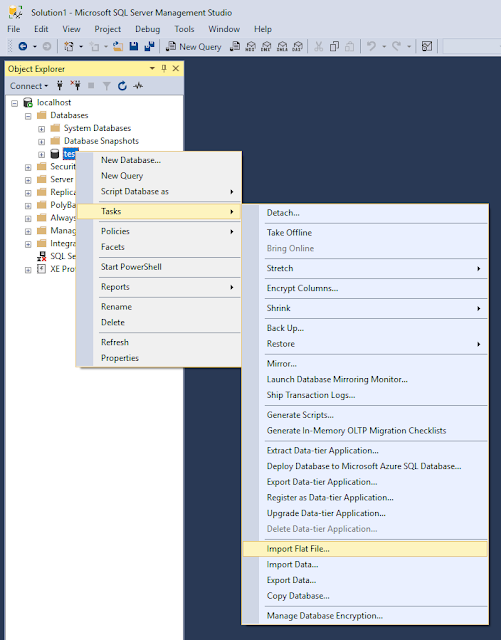
Just a side note on a data extract technique, SQL Server Management Studio (SSMS) version 17.3 or later now has a new feature to Import Flat File along with the common Import and Export Data, you can read more about it here - https://docs.microsoft.com/en-us/sql/relational-databases/import-export/import-flat-file-wizard

So, after populating the data: temperature ~15.5 million records for the date time range from the year 1763 till 2017 and close to 43 thousand of various weather stations around the globe, I was able to place it into my Power BI report and test both types of the Heat Map visualizations. I additionally filtered my dataset then to show the Canadian weather stations landscape only and chose the year 2017 for the most recent data.

I could also change colors for both visualizations, either by manual selection or by specifying a color palette in the edit mode:


ArgGIS Map visualization has a lot of detailed settings that you can choose and apply for your various geo-analytics scenarios (and not only your heat map ones), however, the custom Heatmap visualization brings even more flexibility for adjusting your visualization that ArcGIS Map doesn't have.
So, there are no winners or loosers and I can easily use them both!
About two years ago I already had created a blog post “Excel Power Map vs. Power BI Globe Map visualization” based on the Berkley Earth datasets - http://berkeleyearth.org/data/. At that time I was probing the 3D Globe Power BI visualization, the one that you can use and rotate it right within your report.
This time I thought to check and compare heat map visualizations in Power BI. Currently, there are two ways to see variously heated or cooled geo areas in Power BI, either using a standard ArcGIS Map visualization or a custom Power BI Heatmap visualization from the Office store - https://appsource.microsoft.com/en-us/product/power-bi-visuals/WA104381072?src=office&tab=Overview
The Berkley Earth dataset for this data case exercise came in a form of multiple flat files:

I only used the following fields from the data.txt file:
- Station ID,
- Date,
- Temperature (C)
And from the site_detail.txt file I extracted the following fields to provide more geo details for each of the weather stations that there was temperature data point available:
- Station ID,
- Station Name,
- Latitude,
- Longitude,
- Country
And with some minor data transformation, I was able to build my Power BI data model with two tables:

Just a side note on a data extract technique, SQL Server Management Studio (SSMS) version 17.3 or later now has a new feature to Import Flat File along with the common Import and Export Data, you can read more about it here - https://docs.microsoft.com/en-us/sql/relational-databases/import-export/import-flat-file-wizard

So, after populating the data: temperature ~15.5 million records for the date time range from the year 1763 till 2017 and close to 43 thousand of various weather stations around the globe, I was able to place it into my Power BI report and test both types of the Heat Map visualizations. I additionally filtered my dataset then to show the Canadian weather stations landscape only and chose the year 2017 for the most recent data.

I could also change colors for both visualizations, either by manual selection or by specifying a color palette in the edit mode:


ArgGIS Map visualization has a lot of detailed settings that you can choose and apply for your various geo-analytics scenarios (and not only your heat map ones), however, the custom Heatmap visualization brings even more flexibility for adjusting your visualization that ArcGIS Map doesn't have.
So, there are no winners or loosers and I can easily use them both!
Nice Article, Rayis! It was good to learn about heat maps. - Aditi
ReplyDeleteThanks Aditi, I'm glad that you liked that post. We should work together on some the Power BI projects!
ReplyDeleteChantel st claire Obviously a huge part of treating wrinkles and skin sagging requirements to be increasing the levels of elastic and collagen in the skin but what to try this has remained a small a top secret. This step helps increase the skins moisture content and assists flush away toxins that create blemishes and uneven pigments. http://t-rexmuscleadvice.com/chantel-st-claire/
ReplyDeleteSuper blog thanks for providing keep update Power BI Online Course
ReplyDeleteHaving wrong email id's is also a problem, just a small spelling mistake in the email id won't help in reach out to that prospect
ReplyDeleteData Enrichment
Nice Blog.Thanks for sharing.
ReplyDeletePower BI Training in Hyderabad
thanks for sharing the post on how Power BI heat maps are useful
ReplyDelete