(2018-July-29) My initial attempt to explore and test the ArcGIS Map paid version continued after receiving a response from the ESRI support team. Initially, I couldn't see all the additional features of the Plus subscription and I wrote about that in my last blog post - ArcGIS Maps for Power BI: Free vs. Paid version

But then I received a response from the Canadian Tech ESRI support team on my request to look into the issue of non-connectivity to Plus subscription content in Power BI. Basically, it communicated that all things were OK with the map itself and I needed to check further with Microsoft Power BI support team.

Well, I was a bit disappointed with this outcome; in addition to this, I received a few comments from other people about their unsuccessful attempts to resolve the very same issue with ESRI support team.
The next day I received two other messages: one with a confirmation that my ArcGIS Map Plus subscription had been activated and another email from a business analyst from the ESRI team in the US with a request to check if I still had any issues connecting to my account and additional help was offered if I needed. This restored my faith in people, and they willing to help others :-) Plus, after quickly checking my original Power BI report, I was able to connect to the Plus subscription of ArcGIS MAP, yes!
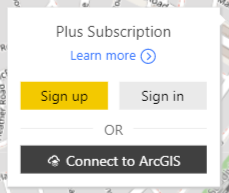
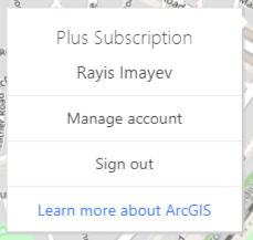
So, this is my story of checking all the new features available in the paid version of the ArcGIS Map in PowerBI.
Basemaps
First, the basesmaps add a contextual background to your map geo points. And with the Plus subscription you have access to 8 new basemaps, identified by a Plus badge on the screen:
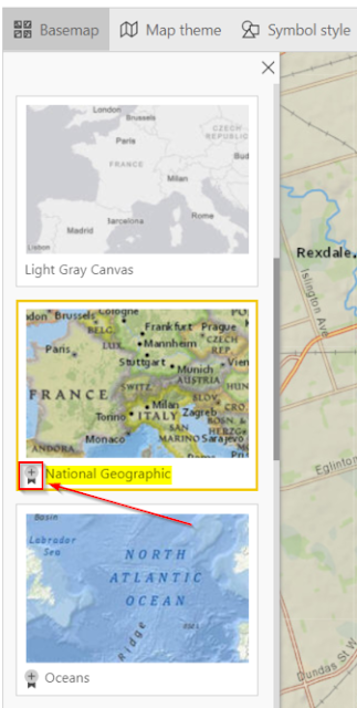
New basemaps are:
- Imagery
- Imagery with Labels
- National Geographic
- Oceans
- Terrain with Labels
- Topographics
- USA Topo Labels
- USGS National Map (USA)
Source: http://doc.arcgis.com/en/maps-for-powerbi/design/change-the-basemap.htm
And my favorite basemep among those eight ones is the National Geographic, it hard to tell why. Probably, because it combines both technical geocoding details like any standards maps, but at the same time, it bears that graphical look from past historical sea voyages into the future endeavors to explore oceans, and I just like it :-)
Reference Layer
With Plus subscription you have access to Live Atlases, which can enrich you map look with other graphical layers on the top of your existent basemep. The search option allows you to examine available layers that you can use. Currently, most of the layers are US based data, but I found a North America Ecoregions layer that showed Canada in so many different colors. Just take a look!

Source: http://doc.arcgis.com/en/maps-for-powerbi/design/add-a-reference-layer.htm
Infographics
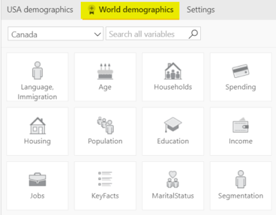
Infographics are just "floating" data cards that you can add to your map with some statistical data (population, age distribution, income levels, etc.) to support either your whole map visualization or a part of it.
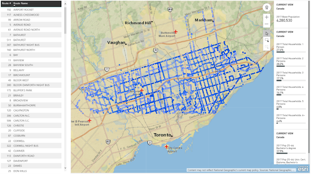
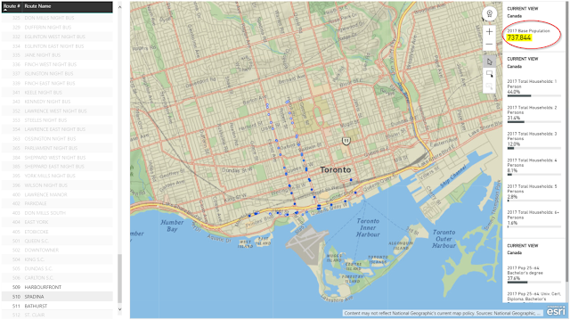
The beauty of those infographics data cards is that their content is updated depending on what you're doing with your ArcGIS. If you select one or more features on the map, the cards will show demographic information for an area around each selected location. See, how the Toronto infographics data gets changed when I zoom my view in to a core downtown area.
Source: http://doc.arcgis.com/en/maps-for-powerbi/design/add-infographics.htm
I won't be making any conclusions at the end. If you prefer using MapBox in Power BI, it's your choice; if you want to give a try to ArcGIS Plus subscription or other map visualization in Power BI, go for it!
For me, this version of the ArcGIS Map also reminded me that I needed to purchase a National Geographic Magazine subscription for my daughter :-)
Happy data adventures!

But then I received a response from the Canadian Tech ESRI support team on my request to look into the issue of non-connectivity to Plus subscription content in Power BI. Basically, it communicated that all things were OK with the map itself and I needed to check further with Microsoft Power BI support team.

Well, I was a bit disappointed with this outcome; in addition to this, I received a few comments from other people about their unsuccessful attempts to resolve the very same issue with ESRI support team.
The next day I received two other messages: one with a confirmation that my ArcGIS Map Plus subscription had been activated and another email from a business analyst from the ESRI team in the US with a request to check if I still had any issues connecting to my account and additional help was offered if I needed. This restored my faith in people, and they willing to help others :-) Plus, after quickly checking my original Power BI report, I was able to connect to the Plus subscription of ArcGIS MAP, yes!


So, this is my story of checking all the new features available in the paid version of the ArcGIS Map in PowerBI.
Basemaps
First, the basesmaps add a contextual background to your map geo points. And with the Plus subscription you have access to 8 new basemaps, identified by a Plus badge on the screen:

New basemaps are:
- Imagery
- Imagery with Labels
- National Geographic
- Oceans
- Terrain with Labels
- Topographics
- USA Topo Labels
- USGS National Map (USA)
Source: http://doc.arcgis.com/en/maps-for-powerbi/design/change-the-basemap.htm
Reference Layer
With Plus subscription you have access to Live Atlases, which can enrich you map look with other graphical layers on the top of your existent basemep. The search option allows you to examine available layers that you can use. Currently, most of the layers are US based data, but I found a North America Ecoregions layer that showed Canada in so many different colors. Just take a look!

Source: http://doc.arcgis.com/en/maps-for-powerbi/design/add-a-reference-layer.htm
Infographics

Infographics are just "floating" data cards that you can add to your map with some statistical data (population, age distribution, income levels, etc.) to support either your whole map visualization or a part of it.

The beauty of those infographics data cards is that their content is updated depending on what you're doing with your ArcGIS. If you select one or more features on the map, the cards will show demographic information for an area around each selected location. See, how the Toronto infographics data gets changed when I zoom my view in to a core downtown area.

Source: http://doc.arcgis.com/en/maps-for-powerbi/design/add-infographics.htm
I won't be making any conclusions at the end. If you prefer using MapBox in Power BI, it's your choice; if you want to give a try to ArcGIS Plus subscription or other map visualization in Power BI, go for it!
For me, this version of the ArcGIS Map also reminded me that I needed to purchase a National Geographic Magazine subscription for my daughter :-)
Happy data adventures!
Comments
Post a Comment