[2016-May-31] Two different metrics, two different datasets, one may represent a very high value and the other one is very low. What's interesting is that both metrics could be very close related; like Total Product Sales vs. Product Price or Average Monthly Temperature vs. Rainfall over a period of time.
One way to analyse how such metrics may influence each other is to look at their numbers, the other way is to visually place them on a bar or a line chart and let those graphical elements communicate to you how correlated or not those metrics are. However there is one downside of using graphical tools to analyse both very low and high data values on the same Y-axis; it's just visually difficult. Therefore many analytical tool vendors allow to portray differently scaled data with the use of Primary and Secondary Y-axes (so called Dual Axes).
Let's take a simple data set and try to check 3 different visualization tools that can show data across different data axes. There is an open dataset of National Pollutant Release Inventory (NPRI) provided by Government of Canada (http://open.canada.ca/en/open-data) that shows different industry related pollutant releases to air, water and land for the past five years.
I've chosen only 2 industries' air pollution data: (1) Oil and Gas Extraction and combined (2) Pipeline Transportation of Crude Oil and Natural Gas, with an idea to find if these 2 metrics' results are correlated over a period of time.
Here is an Excel version of this dataset:
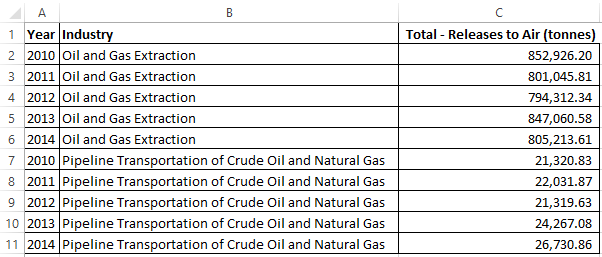
Just looking at the data itself, it's quite obvious that Oil and Gas extraction generate far more air pollution than these natural resources transportation by pipelines. Let's see how Excel chart could show this data:
Excel:

Excel is a good analytical tool and it even gave me an option to see linear trend-lines for each of the metrics (however it's a bit difficult to understand why with the air pollution decrease for the oil and gas extraction, the air got more polluted when this oil and gas had been in a pipeline transition; we'll talk about this later).
Power BI:

The Power BI currently doesn't allow creating a bar chart for a secondary Y-axis; thus we can use a line to show the Pipeline transportation in our case. However all other settings including good data labeling provides us with a very interactive experience for big & small data analysis.
SSRS (SQL Server Reporting Services):

It's a bit different story with the SSRS: from one hand it has a very solid dataset extraction mechanism that is shared across all other SQL Server BI tools, however its visualization part to show both Primary and Secondary axes is not very good: you will have to additionally adjust each of axis top limits in order to sync horizontal lines and I also wish SSRS data label positioning to be more flexible.
I will let you to decide on your own what tool you would prefer to use in order to analyze 2 different metrics data on dual axes. I personally like the Power BI version, then I would go with the Excel way to analyze Primary and Secondary axes data and use of the SSRS dual axes chart would only be considered if the technology is specifically requested by a customer.
As far as the early question about the pollution decrease of oil and gas extractions vs. pollution increase to transport those natural resources using pipelines, one could suggest that during the period of time of 2010 and 2014 resource company have learned to apply modern technologies to produce less air pollution. However the existing pipeline system in Canada may have slightly deteriorated and need more maintenance and modernization. But whatever the reasons are for the air pollution decrease and increase, there have to be some some facts to prove such hypothesis, which may be a part of another blog post or discussion.
Happy data adventures!
One way to analyse how such metrics may influence each other is to look at their numbers, the other way is to visually place them on a bar or a line chart and let those graphical elements communicate to you how correlated or not those metrics are. However there is one downside of using graphical tools to analyse both very low and high data values on the same Y-axis; it's just visually difficult. Therefore many analytical tool vendors allow to portray differently scaled data with the use of Primary and Secondary Y-axes (so called Dual Axes).
Let's take a simple data set and try to check 3 different visualization tools that can show data across different data axes. There is an open dataset of National Pollutant Release Inventory (NPRI) provided by Government of Canada (http://open.canada.ca/en/open-data) that shows different industry related pollutant releases to air, water and land for the past five years.
I've chosen only 2 industries' air pollution data: (1) Oil and Gas Extraction and combined (2) Pipeline Transportation of Crude Oil and Natural Gas, with an idea to find if these 2 metrics' results are correlated over a period of time.
Here is an Excel version of this dataset:
Just looking at the data itself, it's quite obvious that Oil and Gas extraction generate far more air pollution than these natural resources transportation by pipelines. Let's see how Excel chart could show this data:
Excel:
Excel is a good analytical tool and it even gave me an option to see linear trend-lines for each of the metrics (however it's a bit difficult to understand why with the air pollution decrease for the oil and gas extraction, the air got more polluted when this oil and gas had been in a pipeline transition; we'll talk about this later).
Power BI:

The Power BI currently doesn't allow creating a bar chart for a secondary Y-axis; thus we can use a line to show the Pipeline transportation in our case. However all other settings including good data labeling provides us with a very interactive experience for big & small data analysis.
SSRS (SQL Server Reporting Services):
It's a bit different story with the SSRS: from one hand it has a very solid dataset extraction mechanism that is shared across all other SQL Server BI tools, however its visualization part to show both Primary and Secondary axes is not very good: you will have to additionally adjust each of axis top limits in order to sync horizontal lines and I also wish SSRS data label positioning to be more flexible.
I will let you to decide on your own what tool you would prefer to use in order to analyze 2 different metrics data on dual axes. I personally like the Power BI version, then I would go with the Excel way to analyze Primary and Secondary axes data and use of the SSRS dual axes chart would only be considered if the technology is specifically requested by a customer.
As far as the early question about the pollution decrease of oil and gas extractions vs. pollution increase to transport those natural resources using pipelines, one could suggest that during the period of time of 2010 and 2014 resource company have learned to apply modern technologies to produce less air pollution. However the existing pipeline system in Canada may have slightly deteriorated and need more maintenance and modernization. But whatever the reasons are for the air pollution decrease and increase, there have to be some some facts to prove such hypothesis, which may be a part of another blog post or discussion.
Happy data adventures!
Nice overview.
ReplyDeleteI consider the Power BI solution with a seperate Y axis broken, since you cannot force it to use a secondary axis, but Power BI makes the decision on the basis of the data being shown.
I recently had to make a graph with a total as bars, and a percentage as line.
The percentage was in the range 0-100, and when looking at the full dataset the totals were in the thousands. Power BI then made a secondary axis for the line, and all was good.
But when you started using the slicers the totals would reduce, but the percentage stayed in the 0-100 range.
the result is that if the users sllice the data so the totals drop below some threshold, Power Bi drops the secondary axis and uses the same axis for both line and columns.
So a user would se the percentage hover around 90%, that is the line is near the top of the chart, then select a specific week and department, bringing the total below 1000, and suddenly the percentage line hovers near the bottom, because Power BI thinks that 90 is sufficiently close to 900 that a secondary axis is not needed.
Our solution was to reformat the percentage to be between 0 and 1, but it is still not pretty
Thank you skongstad for your comment. Good point about the slicer behaviour with the Combo chart. I would suggest then to remove a manually set limit for the main Y-axis and the let Power BI to take a full control of it. And I never experienced that Secondary Y-axis would automatically turn itself off due to some data issues, will have to check this too. Thanks again for your comment!
ReplyDelete